Watch on YouTube for 1080p
Thursday, 21 March 2013
Wednesday, 20 March 2013
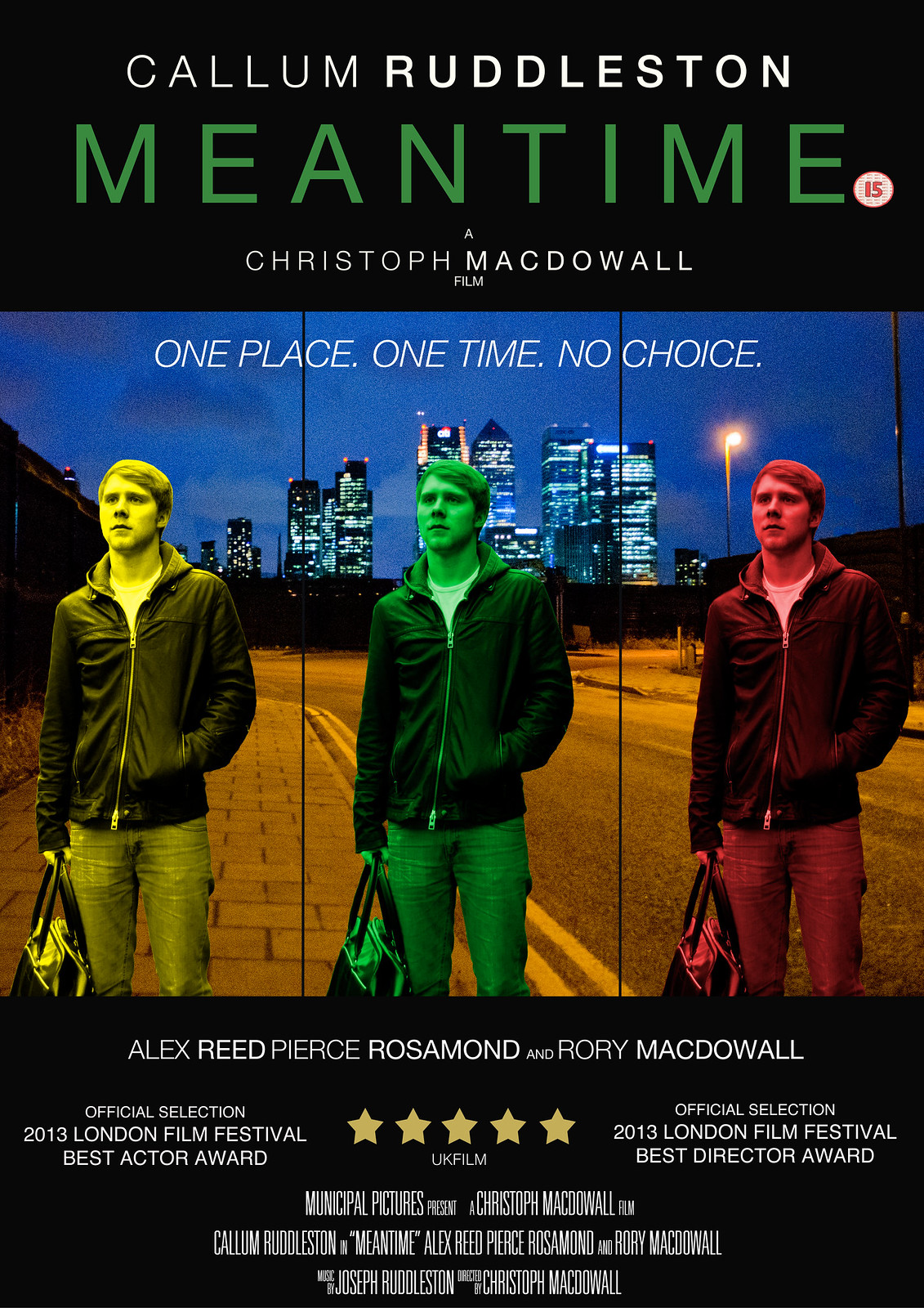
Poster Draft 2

This version has my final images, taken separately then put together through Photoshop, but the way in which I have modified them is subject to change.
Changes I am already making to this draft and will make are:
- I am going to change the central image of Callum to green rather than blue - blue does not seem to stand out enough from the background image, while green will do this but also go with the title colour.
- The overlapping of the images does not quite work to me, and so I will place them further apart.
- I will also add a tagline to the poster, as it is a key component of a theatrical poster which sells the film as a whole to the audience.
However, I am quite satisfied with the way in which both images have come out - my background image of the North Greenwich location with Canary Wharf is particularly strong so I may draw upon this location in my tagline, while the central image of Callum also blends quite well with it - something I am happy with as I was worried they would not go at all.
Thursday, 7 March 2013
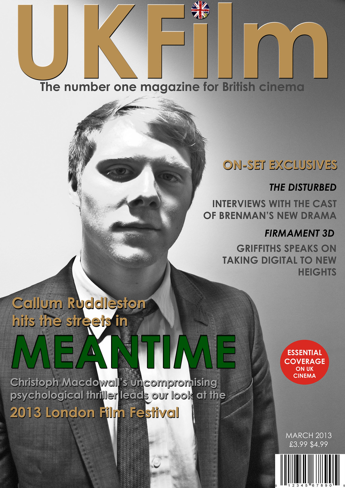
Magazine Draft 2

This is the second draft of my magazine, and possibly my final draft before the finished product as I feel that it has almost fully taken shape. Changes I have made from my first draft include:
- Inserting a picture of Callum done in black and white - I anticipated doing a picture in colour but in a strange way, I found this particular picture done in black and white to be more effective when contrasted against the colours in the graphics.
- I have added shadows to some of the graphics such as the title and the graphics that are laid over Callum in order to make them stand out and look more iconic.
- I have added a puff - 'essential coverage on UK cinema' - to give the magazine more flair.
- I have put a round British flag over the dot of the I, in order to make the title look more like an iconic logo.
Final changes I think that I will make include:
- Some final colour adjustment - the 'on set exclusives does not stand out enough for me so I will either change this colour or add shadow to it.
Monday, 4 March 2013
Magazine Draft 1

This is the first draft for my magazine front cover - the only things missing from it at the moment are the image of Callum and information such as a barcode and the date of the magazine issue. However, some things that I have decided to work on, modify or add are:
- A logo for the 2013 London Film Festival - as the initials LFF have a certain ring to them, it is likely that I will base the logo around that motif.
- Develop the title 'UKFilm' into something more iconic that looks like a logo in its own right - one thing I am thinking of is embedding a union jack within the dot of the I - any larger British motif might detract from the understatement and classiness of the poster, but it is definitely necessary to add something to the title to make it stand out more.
- Puffs - I will add a small puff anchoring the magazine such as Sight and Sound's 'every new film reviewed', but I will also add puff images from other imaginary films or perhaps of film festivals/premieres etc.
- One thing I need to make sure of is that the colour of the title 'Meantime' is exactly the same as the colour that is also in the poster and trailer itself.
Depending on how the actual images I have taken look in the framework of this poster, other aspects of it may also need to be modified, mainly to do with the colours of the different graphics. I may also take more images denoting the 'mean' and tough quality the character develops - something I have already done is have Callum loosen his tie in the images in order to suggest the idea that this is a character who has gone off the rails.
What have you learnt from your audience feedback?


Where do you live?
To this question, there was a unanimous response of urban locations.
What genre do you see this film as having?
The response to this was unanimously thriller. Thankfully, people were specific about the kind of sub-genre my film might have:
6 said psychological thriller, 6 said crime and 4 said suspense thriller - these were indeed the types of sub-genre I was going for. Interestingly, one person said that they believed it was film noir: while I did not think much about the noir aspects that could come into the story, the plot certainly has the mystery of a noir and some of the cinematography has a gloomy, under lit quality (particularly the beginning and end) which could be comparable to the visual style of noir thrillers. Neo-noir films such as Manhunter and Drive have also placed an emphasis on colour, and this is something my film also did.
What aspects of the trailer would persuade you to see it?
13 music
6 story
7 location
9 style and cinematography
3 suspense
2 awards
3 acting
2 awards
3 acting
The fact that the music and visual style was so well received is a good sign to me, as it puts the film within the bracket of films that strongly inspired me, such as Drive, American Beauty and The Social Network - all of these films have been well-received in part due to the combination of music and style, and certainly had an effect on me with regard to how I chose to shoot the film. The fact that people were drawn in by the location is also important to me, as part of my intention for the look of the film was to give a unique vision of London - one that drew upon less of either the traditional aspects of London heritage or the social realist ugliness of films such as Kidulthood to instead focus on the industrial, modern and gritty parts of London that would not be out of place in the films of directors such as Michael Mann.
What do you think is the best feature of this trailer?
The most prominent responses included - a sense of jeopardy, tension, unanswered questions/ambiguities, Callum's character, music and cinematography/style.
The beginning of the trailer was received particularly well, with the bathroom scene being specifically cited once or twice as an example of the way in which the style adds to the film. I was glad that the aspects of the trailer which were harder to control, such as the build-up of suspense and deliberate ambiguities, seem to have been well-executed and have had the effect I wanted, as it is difficult to predict whether or not the audience will genuinely find any piece suspenseful and affecting.
What did you understand from the story? What questions did it raise?
Most people understood the story - almost all responses picked up on the basic structure, which is: the main character struggles to find a job, is given one by a friend, meets a lawyer who gives him suspicious work and suspects that the lawyer is a criminal and has framed him for something. Most of the questions people had about the story were deliberate ambiguities - the contents of the bag was brought up by some people, the nature of the lawyer and who killed the man on the news report. However, one or two people did not pick up on how exactly the lawyer may have set up Callum's character, as the story of the man killed on the radio is not developed in the trailer alone. However, this all contributes to the most important unanswered question which was whether or not Callum was imagining things about the nature of what he had done. I was pleased to see that some people had picked up on the nature of Callum's character: one response suggested that the film as a whole may deal with the human psyche and stability, and be a morality tale in which the different characters might be punished in different ways or to different degrees. Meanwhile, one or two people also suggested that the image of the clock might be an important visual motif.
What improvements or modifications would you make to my trailer?
I have already started working on the improvements some people suggested. Some suggested that the editing could potentially be tightened, particularly in the flashing scenes. I have worked on this by making them fit the musical beats and ensuring that there is always something important going on within the frame. Some people also suggested that the audio quality could be improved - almost all of the specific examples here were of the scene where Callum is on the phone for the first time, and this is something that I will re-record.


Most of the people I interviewed responded to my magazine in the way I had hoped they would, and thankfully went into some detail about which parts of the image were the most successful. The feedback I have been given suggests that my decision to make the main image black and white was the right choice, as it seems to denote the psychological thriller aspects of my story and also sells Callum as an actor given the iconic qualities it has. The use of the British flag on the title and the colouring of the graphics also went down well - in particular, the title of Meantime itself seems to have stood out to my audience as many of them picked up on it, talking about how it was effective as a whole or how the colour in particular made the title stand out.
Most of the people I interviewed responded to my magazine in the way I had hoped they would, and thankfully went into some detail about which parts of the image were the most successful. The feedback I have been given suggests that my decision to make the main image black and white was the right choice, as it seems to denote the psychological thriller aspects of my story and also sells Callum as an actor given the iconic qualities it has. The use of the British flag on the title and the colouring of the graphics also went down well - in particular, the title of Meantime itself seems to have stood out to my audience as many of them picked up on it, talking about how it was effective as a whole or how the colour in particular made the title stand out.
Subscribe to:
Posts (Atom)