Watch on YouTube for 1080p
Thursday 21 March 2013
Wednesday 20 March 2013
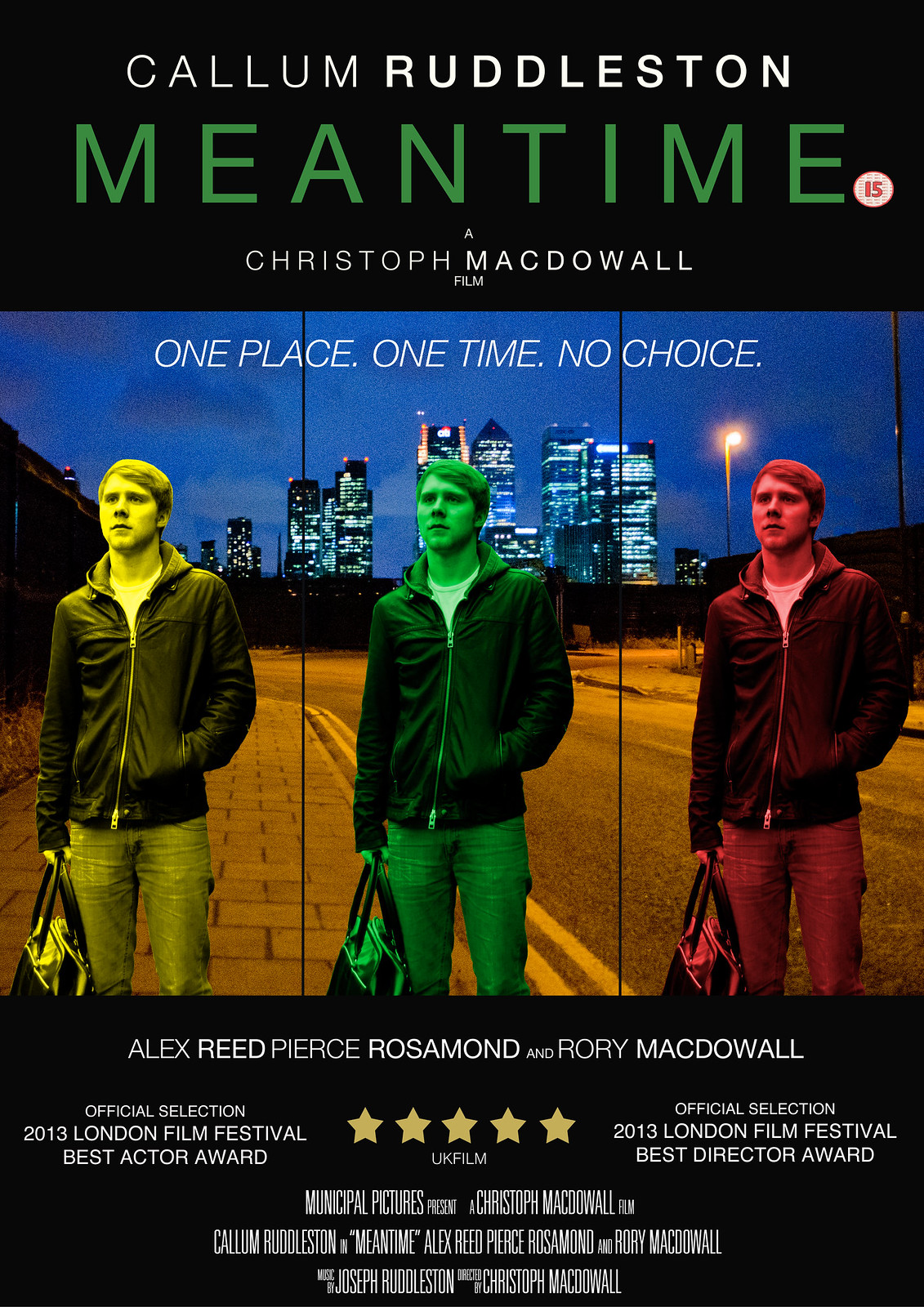
Poster Draft 2

This version has my final images, taken separately then put together through Photoshop, but the way in which I have modified them is subject to change.
Changes I am already making to this draft and will make are:
- I am going to change the central image of Callum to green rather than blue - blue does not seem to stand out enough from the background image, while green will do this but also go with the title colour.
- The overlapping of the images does not quite work to me, and so I will place them further apart.
- I will also add a tagline to the poster, as it is a key component of a theatrical poster which sells the film as a whole to the audience.
However, I am quite satisfied with the way in which both images have come out - my background image of the North Greenwich location with Canary Wharf is particularly strong so I may draw upon this location in my tagline, while the central image of Callum also blends quite well with it - something I am happy with as I was worried they would not go at all.
Thursday 7 March 2013
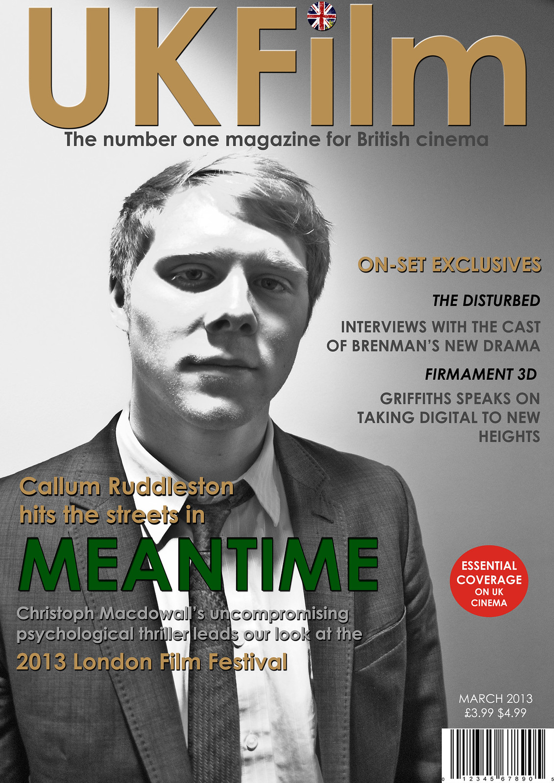
Magazine Draft 2

This is the second draft of my magazine, and possibly my final draft before the finished product as I feel that it has almost fully taken shape. Changes I have made from my first draft include:
- Inserting a picture of Callum done in black and white - I anticipated doing a picture in colour but in a strange way, I found this particular picture done in black and white to be more effective when contrasted against the colours in the graphics.
- I have added shadows to some of the graphics such as the title and the graphics that are laid over Callum in order to make them stand out and look more iconic.
- I have added a puff - 'essential coverage on UK cinema' - to give the magazine more flair.
- I have put a round British flag over the dot of the I, in order to make the title look more like an iconic logo.
Final changes I think that I will make include:
- Some final colour adjustment - the 'on set exclusives does not stand out enough for me so I will either change this colour or add shadow to it.
Monday 4 March 2013
Magazine Draft 1

This is the first draft for my magazine front cover - the only things missing from it at the moment are the image of Callum and information such as a barcode and the date of the magazine issue. However, some things that I have decided to work on, modify or add are:
- A logo for the 2013 London Film Festival - as the initials LFF have a certain ring to them, it is likely that I will base the logo around that motif.
- Develop the title 'UKFilm' into something more iconic that looks like a logo in its own right - one thing I am thinking of is embedding a union jack within the dot of the I - any larger British motif might detract from the understatement and classiness of the poster, but it is definitely necessary to add something to the title to make it stand out more.
- Puffs - I will add a small puff anchoring the magazine such as Sight and Sound's 'every new film reviewed', but I will also add puff images from other imaginary films or perhaps of film festivals/premieres etc.
- One thing I need to make sure of is that the colour of the title 'Meantime' is exactly the same as the colour that is also in the poster and trailer itself.
Depending on how the actual images I have taken look in the framework of this poster, other aspects of it may also need to be modified, mainly to do with the colours of the different graphics. I may also take more images denoting the 'mean' and tough quality the character develops - something I have already done is have Callum loosen his tie in the images in order to suggest the idea that this is a character who has gone off the rails.
What have you learnt from your audience feedback?


Where do you live?
To this question, there was a unanimous response of urban locations.
What genre do you see this film as having?
The response to this was unanimously thriller. Thankfully, people were specific about the kind of sub-genre my film might have:
6 said psychological thriller, 6 said crime and 4 said suspense thriller - these were indeed the types of sub-genre I was going for. Interestingly, one person said that they believed it was film noir: while I did not think much about the noir aspects that could come into the story, the plot certainly has the mystery of a noir and some of the cinematography has a gloomy, under lit quality (particularly the beginning and end) which could be comparable to the visual style of noir thrillers. Neo-noir films such as Manhunter and Drive have also placed an emphasis on colour, and this is something my film also did.
What aspects of the trailer would persuade you to see it?
13 music
6 story
7 location
9 style and cinematography
3 suspense
2 awards
3 acting
2 awards
3 acting
The fact that the music and visual style was so well received is a good sign to me, as it puts the film within the bracket of films that strongly inspired me, such as Drive, American Beauty and The Social Network - all of these films have been well-received in part due to the combination of music and style, and certainly had an effect on me with regard to how I chose to shoot the film. The fact that people were drawn in by the location is also important to me, as part of my intention for the look of the film was to give a unique vision of London - one that drew upon less of either the traditional aspects of London heritage or the social realist ugliness of films such as Kidulthood to instead focus on the industrial, modern and gritty parts of London that would not be out of place in the films of directors such as Michael Mann.
What do you think is the best feature of this trailer?
The most prominent responses included - a sense of jeopardy, tension, unanswered questions/ambiguities, Callum's character, music and cinematography/style.
The beginning of the trailer was received particularly well, with the bathroom scene being specifically cited once or twice as an example of the way in which the style adds to the film. I was glad that the aspects of the trailer which were harder to control, such as the build-up of suspense and deliberate ambiguities, seem to have been well-executed and have had the effect I wanted, as it is difficult to predict whether or not the audience will genuinely find any piece suspenseful and affecting.
What did you understand from the story? What questions did it raise?
Most people understood the story - almost all responses picked up on the basic structure, which is: the main character struggles to find a job, is given one by a friend, meets a lawyer who gives him suspicious work and suspects that the lawyer is a criminal and has framed him for something. Most of the questions people had about the story were deliberate ambiguities - the contents of the bag was brought up by some people, the nature of the lawyer and who killed the man on the news report. However, one or two people did not pick up on how exactly the lawyer may have set up Callum's character, as the story of the man killed on the radio is not developed in the trailer alone. However, this all contributes to the most important unanswered question which was whether or not Callum was imagining things about the nature of what he had done. I was pleased to see that some people had picked up on the nature of Callum's character: one response suggested that the film as a whole may deal with the human psyche and stability, and be a morality tale in which the different characters might be punished in different ways or to different degrees. Meanwhile, one or two people also suggested that the image of the clock might be an important visual motif.
What improvements or modifications would you make to my trailer?
I have already started working on the improvements some people suggested. Some suggested that the editing could potentially be tightened, particularly in the flashing scenes. I have worked on this by making them fit the musical beats and ensuring that there is always something important going on within the frame. Some people also suggested that the audio quality could be improved - almost all of the specific examples here were of the scene where Callum is on the phone for the first time, and this is something that I will re-record.


Most of the people I interviewed responded to my magazine in the way I had hoped they would, and thankfully went into some detail about which parts of the image were the most successful. The feedback I have been given suggests that my decision to make the main image black and white was the right choice, as it seems to denote the psychological thriller aspects of my story and also sells Callum as an actor given the iconic qualities it has. The use of the British flag on the title and the colouring of the graphics also went down well - in particular, the title of Meantime itself seems to have stood out to my audience as many of them picked up on it, talking about how it was effective as a whole or how the colour in particular made the title stand out.
Most of the people I interviewed responded to my magazine in the way I had hoped they would, and thankfully went into some detail about which parts of the image were the most successful. The feedback I have been given suggests that my decision to make the main image black and white was the right choice, as it seems to denote the psychological thriller aspects of my story and also sells Callum as an actor given the iconic qualities it has. The use of the British flag on the title and the colouring of the graphics also went down well - in particular, the title of Meantime itself seems to have stood out to my audience as many of them picked up on it, talking about how it was effective as a whole or how the colour in particular made the title stand out.
Thursday 28 February 2013
Poster - Photoshop Draft 1

This is the first draft of my final poster, made through Photoshop and using an image taken directly from my film.
Things that are incomplete about this poster:
- I have yet to take the final image for the poster, and I would imagine that it will look significantly different from this one - though Callum will have a similar pose except from a wider angle, I intend to take the image at night, and also in an entirely different location.
- I have yet to create a slate with the entire cast and crew on it - something which I feel will give the poster a generally more professional look.
- I have yet to add a rating to this poster.
Positive aspects of this poster:
- Though incomplete, this already has something of a realistic, documentary style, but also feels iconic due to the unconventional colour choice on the title.
- The font and shape of most of the titles seem to work quite well - I am pleased with the effect of putting surnames here in bold.
Areas to improve:
- I am not quite satisfied with the 5 stars I have added - the colour is slightly off for me but this is something I can easily remedy. However, the shape of the stars themselves - the way in which the lines forming the star points are slightly curved gives them a slightly cartoony look which is not often seen in 5 star ratings for films.
- The placement of the graphics is something I will modify, as they do not all look completely centered.
Monday 25 February 2013
How did you use new media technologies in the construction and research, planning and evaluation stages?

Final Cut Pro X:
- My most important tool in the construction stage, and sometimes within the planning stage, was Final Cut Pro X - as I feel that my main strength is as an editor, I used this editing software to produce some of my planning as well as the final task.
- I had some experience of Final Cut Pro X before the beginning of my A2 year, as I had used the same software to previously produce my AS task. This meant that I was happy to use Final Cut as a form of technology to produce some of my planning at any stage, as it is an impressive piece of software but one that I could use fairly easily.
- I used Final Cut as a way of editing together some location recce footage and also in analysing my choice of actor and influential actors.
- In producing the final task, however, I came to develop my skills in Final Cut as creating the piece required me to broaden my knowledge of the software.
- The creation of my ident was done through Final Cut, and here I used many of the features of the software in order to create something that looked professional: I sped up the shot of the buildings by x8, applied colour correction to make it look more stylised, and employed the Ken Burns tool in giving the effect of it shrinking back while the studio title is revealed.
- I frequently modified the colour balance, saturation and exposure of my images in order to make them look sharper and more stylish. I also used tools such as the blade tool in order to produce frequent cuts to and from black towards the end of the trailer, and the stabilisation tool in order to give a smooth look to the camera motion during the aerial shot of the industrial location.
- I also used Final Cut to edit the audio - on the radio announcement, I applied the 'telephone' effect to give the sound of a radio voice.
Blogger:
- Blogger has been a useful tool for me, as it has allowed me to post my research, planning, construction and evaluation updates frequently and artistically.
- Through Blogger, I have been able to embed Prezis and PowerPoints, upload pictures, transfer text and attach videos from YouTube: as well as being a reliable, easy-to-access service which allows me to frequently post updates, it has also given me the freedom to be able to present evaluation in artistic and original forms.
Photoshop:
- I knew little to nothing about Photoshop before beginning to use it in creating my poster and some of my evaluation tasks, though I am now developing my skills with it and have found it particularly useful with regard to presenting my evaluation.
- Despite initially struggling with Photoshop, I now find it to be a straightforward way of presenting images in a professional manner - frequently in my evaluation, I have had to create collages of multiple images, and Photoshop has always been useful for this - I created a professional looking image which was a combination of 9 frames from my trailer for one of my evaluation questions, and I am happy with the result of it.
- When making the poster, I had to test the skills I had developed as I superimposed an image of Callum into a separate background picture of my Greenwich location - I used the magnetic lasso tool to crop Callum out from a photo and the result of this was surprisingly impressive. Using Photoshop was definitely the right choice for creating my poster as I know of no other photo editing software that would allow for me to cut out and superimpose images as easily and also effectively.

*CLICK TO GO TO FLICK PAGE*

*CLICK TO GO TO FLICKR PAGE*
View on YouTube to see annotations.
Thursday 14 February 2013
In what ways does your media product use, develop or challenge forms and conventions of real media products?

Unique Selling Point/Studio
I think that from my film’s
conception, I generally focused on the style of it and how there would be a
sense of visual storytelling, particularly with regard to the psychological
aspects of it. Before I had even finished coming up with the story I knew that
my main aim for the trailer would be to present a different, more stylized view
of London and this is something that I feel I succeeded in. Some of the most
memorable shots from my trailer which I feel would be the most iconic include
an image of Callum standing outside a modern bar in smart casual having been
rejected from job interviews, and his character doing his morning routine –
something that makes his character a relatable one to the audience. The latter
shots in particular, however, have a surreal edge to them as the only source of
light in them is an eerily green glow which makes Callum a silhouette. Shots
like this define the nature of my trailer: it focuses on a relatable central
character, but one who is involved in dark and bizarre situations to the point
where he cannot psychologically endure them.
The aesthetics of my trailer, as
well as some aspects of the story and certain scenes which are based more on
crime films such as Drive than
psychological dramas, to me make it something which could have an appeal to
quite a wide range of audience, including audiences outside of London and
England. The FilmDistrict studio is an example of a studio that I feel has
distributed or produced similar products to mine – in the last two years, they
distributed the thrillers Looper
(2012) and Drive (2011). Both of
these films have higher production values to mine, but in terms of genre and
style I feel that mine is comparable to them. Even more relevant to me is the
fact that it is the production company behind Only God Forgives, an upcoming film with a low budget of 3.5
million dollars, but one with a big name actor (Ryan Gosling) and award winning
director (Nicolas Winding Refn) attached to it. This is certainly a similar media
product to mine and in fact, some of the closing shots of my trailer were
influenced by it. However, the most comparable of Refn’s films to mine in terms
of the production is the British film Bronson,
which featured a rising star of 2008 who has now gone on to become a major
actor in the business – Tom Hardy. The producer and distributor of this film is
Vertigo Films, which also distributed the 2010 film Monsters, another low-budget film with a more wide appeal. If my
film were to receive more low-key and low-budget production and distribution, I
feel that Vertigo Films could be responsible for it.

Narrative/structure
Like most films in my chosen genre –
psychological thriller – the plot is quite character based. The common
structure of a trailer is a 3 act structure: the first act serves to establish
the character, the second act tells some of the story and introduces characters
and situations, while the third act is generally a montage which serves to
heighten the drama of the trailer by hinting at conflicts, danger and plot
progression. I chose to adhere to this structure, as it is a good way to
introduce a variety of characters, situations and themes while also focusing on
the journey of a central character who generally comes to bring about the
psychological aspects of the story.
In keeping with the fact that the trailer
advertises a somewhat understated and even art house drama, I decided that it
would use neither voiceover narration nor graphics to tell the story, something
which more mainstream and high scale films tend to do – however, the fact that
it does not even use character narration is also to an extent a departure from some
psychological thriller trailers which influenced me, such as the trailer for Memento, which frequently introduces
characters using contrasting words in graphics such as ‘ally’ and ‘liar’ to
show the ambiguous nature of the main character’s perception, and the trailer
for Fight Club, which uses the narration
of Edward Norton’s character to provide some exposition.

Colour + style
I feel that a key aspect of my trailer is
the use of colour within it. To an extent, the colours act as a way of
developing the story and ideas within it rather than simply being present for
aesthetic effect – influenced by the Michael Mann film Manhunter, I chose to make green a symbol of and security and also
the ordinary for the character played by Callum in the same way that it is this
symbol for the Will Graham character in Manhunter.
As the film goes on, this colour is replaced by more harsh reds, blues and
yellows until the final two shots before the title, in which green is the
dominant colour in both of these shots in order to suggest that the main
character has truly arrived in a life of violence and unforgiving choices by
the end of the film. Though the use of colour is important in psychological
thrillers in the vein of Manhunter,
it is less prominent in British films which generally take a more social
realist perspective, and this I think is where I make my main departure from
the conventions of the type of film I am making.

Genre
One of the most important conventions of
psychological thrillers is a sense of ambiguity – from unconventional dramas
like American Psycho to blockbusters
like Inception, questions are often
raised about the nature of the plot due to instabilities in the psyches of the
central characters. My film is no exception to this – the third act mainly
deals with the question of whether or not Callum’s character is imagining the
repercussions of his job. Typical to the genre, Callum’s character seems to
become more unstable and dangerous as the ending montage goes on, from accusing
the lawyer of setting him up to violently confronting him and eventually going
on an implied violent offensive against those who he believe are following him
and attempting to steal back the bag.
However, there are aspects of hybridity
within the genre or genres of my trailer – the psychological aspect is only
introduced in the third and last act. The first act sets the film up to be more
of an arthouse drama, with bold colour use and calm piano music influenced by
films such as American Beauty. The
second act, meanwhile, feels most like a crime film to me – in order to raise
the tension of this scene, I shot it like a heist or exchange seen in Michael
Mann films such as Heat or Collateral – the mysterious nature of
the bag of my trailer is influenced by the briefcase exchange at the beginning
of Collateral, while the location feels like the industrial, urban Los Angeles
locations of Heat. In this way, I feel I have challenged the conventions of
psychological thrillers by making a film that changes and develops during the
course of the narrative – in films such as Memento and Fight Club, the
psychological aspects of the film are explained or at least suggested from the
beginning, while in films such as Shutter Island there is a twist ending to
develop the psychological aspect of the story. My film, however, shows a character
whose mind is influenced by his surroundings – from the meeting with the
lawyer, who I made seem as suspicious and intimidating as possible, to the fact
that a murder was committed on the road where he picked up the back only
minutes before he was there.

Sound
Inspired by films
like Drive and The Social Network, I wanted to create a soundtrack that would
be both fitting within the context of the film, but also something that the
audience could listen to on its own. Therefore, I decided that the soundtrack
should be based mainly on electronic or versatile instruments – like The Social
Network, the soundtrack for my film is a mix of electronically based music with
a strong sense of pulse and melody, and atmospheric piano.
The first track is strongly inspired by the
soundtracks from American Beauty and The Social Network – the trailer as a
whole is in the thriller genre, but I felt that the more minimalistic and
slightly haunting qualities which the piano tracks from these scores possess
would be suitable for the first act of the trailer, as it deals with the main
character’s alienation in a way that feels more like a drama than a thriller.
The second and third tracks, meanwhile, have a low-key intensity created by the
use of electronic rhythms and instruments which become increasingly dissonant
as the action intensifies.
Location
I also took particular care in choosing my
locations, as I did not want the trailer to feature any settings typical of
London or even England: I felt that in the context of an understated drama,
they would be distracting. This means that I avoided any locations and English
symbols that would look clichéd – the short scene set in the city between
Callum’s character and the lawyer, for example, was not set in a recognizable
part of the city center, but in a sleek, modern area with no recognisable
London features.
As well as trying to avoid clichéd London
images such as the red buses, I also chose locations which I thought would be
seen more in an American crime thriller than a British one. Two of the most
common kinds of British thrillers are social realist dramas such as Kidulthood and black comedy capers that
directors such as Guy Ritchie are known for making, and I chose to avoid these
locations in order to make the audience feel less familiar with the settings in
order to raise the suspense. The bar I chose had a postmodern look with low-key
lighting so as to feel different from the traditional pubs featured in films
such as RockNRolla – it also set up a
suitable atmosphere for the film. Meanwhile, in the urban locations such as
when Callum’s character takes the bag or sees someone else carrying it, I chose
industrial landscapes and A roads that were influenced by some of my personal
favourite American thrillers such as Collateral or Marathon Man.


Graphics
Despite the fact that my film is a
psychological thriller, I wanted one of the selling points of the trailer to be
the more arthouse qualities of the film and the filmmakers working on it. As a
result, the graphics of my trailer are as understated and stylish as possible,
and also bring to light the names working on the film.
The font I chose is Helvetica, as it has a
minimalistic and stylish quality which I thought both reflected the nature of
much of the film and also looked suitably professional – in choosing this kind
of font, I was influenced by dramas such as American
Beauty and Shame rather than the
psychological thrillers I had also been looking at. The simplistic type of font
that I chose is seen in the trailer of Shame and the placement of it,
particularly with the accolades it received, also influence me: I feature my
accolades in a cross dissolve with a long shot of Callum from behind, similar
to one found in the Shame trailer.
Meanwhile, I was influenced by the use of bold and italic typeface seen in
graphics for films such as American
Beauty and The Social Network –
an important strategy I adopted, inspired by these films, was to have the
surnames of the names I mention in bold fonts to establish them as big names
which could be a selling point for the trailer.


Actors, character and costume
The casting choices I made were naturally
important to the atmosphere my film was trying to create: I decided to make the
trailer have an obvious leading character who is immediately made to appear
sympathetic to the audience by showing him rejected from job interviews and
going about his daily life in the first act of the trailer in order to make him
seem initially relatable. However, I also wanted to give a sense of star power
in the trailer as the central character comes to switch gear and become more
intense in the way that the main characters in films such as American Psycho,
Memento and Fight Club do. Therefore, I casted a lead actor who I felt had the
look and style of a metrosexual leading man such as Ryan Gosling. For the
lawyer, I wanted to create someone who could appear to be a villain but also
seem not dissimilar to the main character when he is first seen – therefore, I
chose an actor not that much older than Callum Ruddleston, but dressed him in
fairly garish clothing such as a turtle neck in order to make him appear
affluent but also apart from the crowd in a way that could later become
sinister.
I also needed to give my main character a
strong sense of characterisation to my central character – my task was to make
him seem relatable through his outfits, but also give him a noticeable
intensity and uniqueness. He is dressed in expensive clothing which has both a
trendy but also unconventional look – during the brief moments in which he is
seen wearing a suit, he is dressed in brown with a knitted tie, while his
favoured casual look is a plain white T shirt and leather jacket. This costume
is highly symbolic of his character, as a plain white T-shirt is considered to
be a symbol of aggressive masculinity within films, something which the
character seems to develop towards the end of the trailer.

Title
I chose to make my title green, on black - this colouring reflects one of the most stylised shots in the trailer, and in a more subtle way reflects the themes of the location: the title 'mean time' put in green to me references the GMT laser and therefore the more industrial, modern locations that surround it. In this way, the title calls to mind ideas of location and aesthetics rather than ideas about identity and status within British society in the way that films such as Bullet Boy or Kidulthood do.

Sunday 10 February 2013
Soundtrack/Score Development
When making the trailer, I had three pieces of pre-existing in mind, one for each act - the first was 'Hand Covers Bruise' from The Social Network, the second was 'On The Beach' from Drive and the third was the theme to the film 'Heat'.
The sound I imagined for the third act comes in at around the 3:30 mark.
I have had Joseph Ruddleston (who is the brother of my lead actor Callum) working on the soundtrack instead of trying to find copyright free music or, indeed, writing it myself - this is because I want my trailer to appear to have a unique sense of mood and style that could be a selling point of it, and in order to achieve this it is essential that I have a soundtrack that is as professionally done as possible which also feels iconic in its own right.
Joseph has sent me some draft versions of his score and so far, many of the ways in which his work has differed from my expectations has been a positive thing for me. His piano piece was less minimalistic than I pictured but this makes the piece feel more authentic as a whole, while his track for the third act has more of a melodic theme to it before it becomes dissonant and intense, but I feel that this also gives the soundtrack a more listenable quality and fits perfectly with the film.
I feel that I am at an advantage with who I have chosen to write the score as he is highly skilled, meaning that he has been developing a refined version of his soundtrack based on feedback I have given him. The soundtrack of this trailer is highly important to me and I feel that as long as it is finished within the next few days, I will be able to upload my trailer before half term with a truly effective soundtrack.
Friday 8 February 2013
Magazine Research


Publishers
Bauer Media
 Empire
Magazine is published by Bauer Media Group, a company which owns over 100
different brands, in particular magazines which it sells over 38 million of a
week. The company was founded in 1875 and has been privately owned by the Bauer
family since then. Other than Empire Magazine, Bauer Media owns Q and Kerrang,
two highly popular music magazines, Heat, the definitive celebrity magazine,
and Magic 105.4, a top radio show. This demonstrates how Bauer Media is not
solely focused on products relating to film.
Empire
Magazine is published by Bauer Media Group, a company which owns over 100
different brands, in particular magazines which it sells over 38 million of a
week. The company was founded in 1875 and has been privately owned by the Bauer
family since then. Other than Empire Magazine, Bauer Media owns Q and Kerrang,
two highly popular music magazines, Heat, the definitive celebrity magazine,
and Magic 105.4, a top radio show. This demonstrates how Bauer Media is not
solely focused on products relating to film.
On the Bauer Media web page, Empire Magazine is
described as ‘the premier movie
destination, providing indispensible insight into cinema, both blockbusting and
classic. Online, in print and via app Empire’s unparalleled access has led to
world-beating exclusives such as the first look at Heath Ledger’s Joker, to
extraordinary access to Steven Spielberg who guest edited our 21st
birthday issue, to George Lucas’s backyard in the run up to Indiana Jones and
the Kingdom of the Crystal Skull’
British Film Institute

Sight
and Sound Magazine is, unlike Empire, owned by a company exclusively based on
film – the British Film Institute. The British Film Institute was formed in
1933 by the Royal Charter in order to ‘encourage the development of the arts of
film’ and promote it – therefore, Sight and Sound is a slightly more cerebral
magazine than Empire due to the publishing behind it. The British Film
Institute has now also taken over the UK Film Council, meaning that most of the
funding for British film comes from here. I think that a magazine which would
have my film as the main feature would be more likely to be similar to Sight
and Sound than Empire Magazine – therefore, the British Film Institute is a
relevant institution to me.
Wednesday 6 February 2013
Shooting Schedule - Poster and Magazine
Taking images for poster and magazine
- General location required for main poster and magazine images is near North Greenwich tube station - an industrial area that is not far from the O2 entertainment centre and the river. This is not far from my house and takes around 15 minutes on a bus (it is also the area where I filmed the picking up the bag scene for the film).
- I will need to take:
- I will need to meet my actor at this location at around 3:45 to take the magazine image, which is going to be a daylight one. However, as I need to also take a night time shot I do not want to take this too early as it will create unnecessary waiting time before taking my main poster shot. For both the magazine and the poster shot, the character will wear the same outfit, which is the one he wore during the scene where he picks up the bag.
- I aim to take my night time shots at around 5 o'clock to 5:30. This will give the shot a night time look, but also have some light which will guarantee that the shot is clear.
- Over the half term period I will also aim to take 4 other shots for invented films to go on my magazine cover. I am going to create a variety of images - one with hints of science fiction, one arthouse, one a mainstream blockbuster and one a period piece. I will be taking at least one of these during the second week of half term as that is the best period of availability for any actors that I may use.
- General location required for main poster and magazine images is near North Greenwich tube station - an industrial area that is not far from the O2 entertainment centre and the river. This is not far from my house and takes around 15 minutes on a bus (it is also the area where I filmed the picking up the bag scene for the film).
- I will need to take:
- Digital camera
- 1 light
- Reflector
- The bag as a prop for the main magazine image
- I will need to meet my actor at this location at around 3:45 to take the magazine image, which is going to be a daylight one. However, as I need to also take a night time shot I do not want to take this too early as it will create unnecessary waiting time before taking my main poster shot. For both the magazine and the poster shot, the character will wear the same outfit, which is the one he wore during the scene where he picks up the bag.
- I aim to take my night time shots at around 5 o'clock to 5:30. This will give the shot a night time look, but also have some light which will guarantee that the shot is clear.
- Over the half term period I will also aim to take 4 other shots for invented films to go on my magazine cover. I am going to create a variety of images - one with hints of science fiction, one arthouse, one a mainstream blockbuster and one a period piece. I will be taking at least one of these during the second week of half term as that is the best period of availability for any actors that I may use.
Subscribe to:
Posts (Atom)