Wednesday 12 December 2012

Title Planning

For my title, I was influenced by mostly one word titles such as 'Memento', 'Shame' or 'Drive' - titles which have obvious and dramatic connotations. In fitting with the fact that the style of this film as a whole is generally different to the more urban, street-based stories of crime and gangs that British cinema is renowned for, I wanted my title to refer more to the ambiguities of the story and the development of the main character, in particular his questionable morality and the questionable amounts of danger that are placed upon him. Words that came to mind included:

  • Uncertainty
  • Doubt
  • Apparition
  • Illusion
However, I realised that as well as bringing to mind the ambiguities of my story, I also needed the title to have a strong and bold feel that has a more visceral tone. I came up with:
  • 'Disturbed'
a title which, in my opinion, denotes brutality and makes a bold statement about the film and the main character. As well as this, I feel that having a graphic announcing this as a title after the final shots of the film - the character of Frank looking out of his house window at something the audience never see - could also suggest the ambiguities of the film, but in a more tough and dark way. 

Sunday 9 December 2012

Graphics Plan


I produced this in order to test out certain templates on Final Cut Pro X and see whether they would work as titles for my final trailer. Overall, I feel that they work well for the atmosphere of my trailer and actually look quite professional. A few points of note, however:
  • As it stands, I am going to use the second film festival accolade template, with the cross dissolve between the graphic and the video footage, taken by me, that plays after it - I feel that it has an immersive quality. However, this is subject to change depending on whether the cross dissolve works with the actual camera shot which will follow on from the film festival graphic.
  • I am not sure about the graphics template which announces my name as a director - the way I have laid out my name, with the 'Helvetica Nue' font and the surname in bold is very professional looking in my opinion, though the way in which it fades between 'a film by' and 'Christoph Macdowall' could be too slow paced for my trailer.
  • The font I used for the final title template is called 'Hei', though it is not the same as the fonts I used for the actor and director names, as putting certain words in bold within the 'Hei' font did not seem to work. However, the two fonts do not feel mismatched so this is not a particularly pressing issue.
  • My idea was to, when announcing the name of the lead actor, have the surname in bold and the first name in regular typeface - what I actually did, however, was make his first name in a particularly light typeface and I feel that this is far more professional looking.

Studio and Distribution Research

The kind of film I plan to make is medium budget, sophisticated and not inherently British in the way that thrillers such as films such as 'Ill Manors', a film using the London riots as a setting, are. As a result, production companies such as BBC Films or FilmLondon are not the kinds of production companies that would produce and distribute my film - they tend to focus on more low-budget films that have a more realistic, gritty British edge. A production company that has produced some fairly prominent films that are not quite at the level of high budget blockbusters but are not totally independent and low budget is Endgame Entertainment: this year, they were attached to the successful sci-fi film 'Looper', which was made on a budget of $30 million - as it is a science fiction film with two major stars, it naturally has a higher budget than what mine would have though I still believe that ours are in a similar category of films. Endgame Entertainment also produced 'An Education' (2009), a British film, 'I'm Not There' (2007), a biography of Bob Dylan with an arthouse edge.


Another production company that I can picture being attached to my film is FilmDistrict, the ident of which is something that has also inspired me. FilmDistrict also distributed 'Looper' as well as the film 'Drive' which, of all the recent films, has been one of the most influential for me. FilmDistrict generally produces fairly commercial films, however, and is based in Los Angeles, and so it is unlikely that it would actually produce my film - only distribute it.


For the production end, I picture Focus Features as making my film. They are a division of NBCUniversal, though are responsible for making arthouse films. In the past, they have made 'Eastern Promises' (2007) and 'In Bruges' (2008), two British films that I think mine could be comparable to.


However, as my film will be reasonably low-budget and will be a British production, I feel it is necessary to address British production companies that specialise in smaller scale films. The main British production companies that produce low budget, London based films are: BBC Films, Film4 and FilmLondon.


Though my film is fairly ambitious and I can picture it having some international production and distribution behind it, I also think that with the actual production of the film - particularly with regard to acquiring locations and supporting actors - it would be necessary to work with a production company such as FilmLondon.

Ident Planning

For this trailer, I have decided to raise the bar with regard to how I produce my ident and intend to go beyond simply using a Final Cut Pro graphic template like I did last year. I have decided to play to my strengths and make an ident out of video footage and editing rather than using an advanced computer software, which I am less advanced with. 

Two idents in particular influence me for the kind of ident I want to make, Film District and Miramax:


The Miramax ident in particular is something I think I could replicate - London generally is not a high rise city, though I live fairly near the Canary Wharf district which is the main high rise centre within London, and it would be easy enough for me to get stylish and good quality video footage of the area. This is a still image from video footage I have taken of Canary Wharf in the past with my own camera, and I am hoping that with more time and a better quality camera I will produce an image suitable for my ident.


What I would like for the actual title is for them to fade in while the image itself fades to black - rather than have the title placed in the middle of the shot like Miramax, I am going to place them just above the skyline of the buildings of Canary Wharf.

Friday 7 December 2012

Sound Planning

Diegetic sound

Recently, I practiced using microphones to record dialogue - the difference between using a boom microphone and a camera microphone, or even a directional microphone when it comes to filming dialogue in a busy place became instantly noticeable. All of my key dialogue scenes occur in busy places, for example a bar and a city street, meaning I will definitely need to use the boom microphone to film. Obviously, it is more complicated and some dangers will arise, for example:

  • The boom microphone may show up in the frame when being held - this sometimes even happens in TV, and occasionally with films a boom microphone or operator is seen in the reflection of a window or mirror.
  • It will also mean that I will need a clapper board in order to sync the sound from the microphone track and the video recording from the camera.

Ambient sound

I also plan on using a separate microphone track from the camera, using a boom microphone, to record ambient sound. I will create separate ambient tracks to play during the bar scenes, outside the bar, the meeting on the bench, when Frank picks up the bag and when he is in the market. These will all be done on location, so I will be taking the microphone to the Zerodegrees bar, the road outside it and the Spitalfields area.


Tuesday 4 December 2012

Aesthetics and Visual Style - Planning

One of the directors who influences me the most with regard to visuals is Michael Mann. As a director, he is renowned for his visual style, particularly his use of cities and modern architecture. Often, in films such as 'Heat' or 'Collateral', the architecture and shape of the cities he uses - in the case of both these films, he uses Los Angeles - dominates the framing, or is at least prominent within it. This style of filming has influenced many other directors and films, most notably the recent film 'Drive'.


Even in indoor scenes such as the famous bank heist sequence from 'Heat', Mann chooses locations demonstrating stylish modern architecture.


As well as having a mise-en-scene demonstrating modern architecture and city lights, Mann also uses colour in an expressive way in his films, particularly the film 'Manhunter'. This has influenced me very much, and I have found ways of adding colour and style to certain locations in my film and will be utilising these.


Most low-budget British films adopt a very different visual approach to what I am influenced by and how I picture my trailer to end up looking - this comes down to the fact that mine has a different subject matter to theirs. Most British thrillers are often based around social realism and are designed to reflect the struggles of British youths in an honest way, and as a result they do not try and stylise their visual style and often set their films in the more gritty parts of London such as council estates. Though there is clearly commentary behind this, I think that the handheld camera style adopted by most British thriller filmmakers and the washed out colour palettes that are often seen in British films are overdone and are uninteresting from a filmmaking perspective - above everything else, my film is based around the middle classes and is more of a morality tale with psychological themes than a story about social struggles and youth crime culture.

The kind of visual style I want to avoid.

One of the locations I have chosen is the Spitalfields area. Though it is not too far off the settings of social realist thrillers, in terms of basic appearance, to me it has very different connotations. The architecture there is a mix of old and new, and has a pristine look to it - it is surprisingly close to the city, with some iconic modern highrise buildings being within sight when one is there.


These are images I acquired while reccying the location.

Directors such as Michael Mann also often use postmodern architecture in their films, with 'Manhunter' being the best example of how he uses this.


Influenced by the kind of postmodern and often metallic looking architecture seen in films by directors such as Michael Mann, I have chosen to set some of my trailer inside a bar which is also a microbrewery.


Friday 30 November 2012

Planning Schedule

Sound - address foley sound, comment on plans for how to take sound. Write up on our sound test. Comment on plans for diegetic sound.
Graphics - research for actual film title e.g. font, motion, positioning, stylistics. Does it carry any sound with it? Planning for graphics.
Research for ident and planning for ident.

Wednesday 28 November 2012

Graphics Research and Planning


These four titles are examples of graphic titles in films that I particularly liked. The graphics for Shame (far left) and The Social Network (left) are both examples of understated fonts, the kind that I feel would fit in with the minimalistic atmosphere of my film. The colour of th etitles is white and possess no overstated animations and transitions. The main striking point of both of these graphics is that the creators have chosen to emphasise certain words via italics or bold font - this is a subtle yet highly effective approach to making titles, as it stresses the importance of what they show which in turn gives them a professional look. I strongly believe that I will transfer this technique into my trailer on whatever I decide will be the marketing point of the film - possibly my own name as a director. The other two titles are from Reservoir Dogs and Drive, two more alternative films that have enjoyed much popularity in certain circles and are cited as unique and distinctive. The graphics they use only add to this - both titles are done in a noticable colour, from mustard yellow to pink, and have a flashy font. Though this is not the kind of atmosphere I am hoping to create, one thing that interests me about both is that they are both shown over a shot from the film. In both cases, the shots have an iconic feel though are relatively basic, only really showing the characters from the film. If I were to have my graphics run over a shot from my film - which is not unlikely, as I want my trailer to have a sense of momentum and to not consistently cut to black - I would take this into account.


The image on the far left is an examle of the Cannes award for best director in its standard format, and it is easy to see why having something like this alone would fit into the atmosphere of my trailer as the font and style is similar. Furthermore, I would have no objection to this playing over black as it would still be a selling point for the film, meaning the audience would not be disengaged by a cut to black. However, the film festival graphics for Shame (middle) felt particularly compelling to me. Having my film festival graphics run over an important or impressive shot from the film would help the audience know what kind of style to expect from the film and would suggest to them that it is of a high quality, more so than a simple and more ambiguous film festival graphic over black. The graphics on the right are for the film Moon, and are an example of film festival graphics which have been modified to further fit the atmosphere of the film, doing what Shame does to an even greater extent. The furthest extent to which I would modify the look of the film festival logos is to remove the image of the wreath to give it the sparse look of my film as a whole which, though not a particularly big change, may be subtly effective.

Soundtrack Research and Planning


These are the two pre-existing soundtrack songs which I picture would fit best with the first act of my trailer. They are both done in a reasonably classical style, choosing piano as the main instrument, though the song from 'The Social Network' in particular has a modern sound to it due to the fact that it has a highly understated quality and mixes a classical piano sound with a minimalist electronic background layer of sound. This style I feel would work well in the opening of my trailer as it has a distinctly modern atmosphere due to the locations and costumes, but I also want it to have a universal and timeless feel, which peaceful piano music will add to.

The music that will play during the second act I feel will be similar to something like the beginning of the song 'On The Beach' from the soundtrack to the film Drive. It has no melody and is accompanied by percussive sounds that also have an electronic feel, making them fitting with the atmosphere of my film.  This kind of music should achieve a dangerous atmosphere - unlike the two tracks in the opening, it will also have less of a broad, expansive sound and instead it will back up and help carry the narrative which is what the second act of the trailer is about.

As for the third track, I also picture part of the song 'On The Beach' from Drive, except a segment of it that comes later in the track, at 4:50. This is a version of a recurring theme throughout the film - it is legato yet without a real melody, peaceful but also ramped up in intensity when compared to the other versions of the same theme. In the more desperate, intense context of my third act I picture music similar to this segment of the track to provide both a counterpoint to the frantic nature of the third act but also subtly add some intensity and drama to it.

The opening to 'On The Beach', which I think will work in my second act, is also used in the middle of the trailer for the film Drive, at the 0:50 mark.

Monday 5 November 2012

Planning Schedule 2


Actors and characters - Friday 9th
Storyboard drawings finished - Tuesday 13th
Editing storyboard - Monday 19th

Still to do

Recce of bar sound and light
Research into studio/distribution
Design and create ident
Other graphic planning for main title, font for critics etc.
Sound

Sunday 7 October 2012

Location Test Footage


Actor Research - Influential Actors

Bar Location Research


The bar I have chosen to film the conversation scene early on in the film in is called Zero Degrees and is located in Blackheath village - not far from where I live, making it practical enough to get to and from. However, actually filming there could potentially be problematic so recently I went over to scout out the location and take some pictures of it. My three main problems with it were a) the lighting of the location, b) how busy it would be and c) the availability of it.

I went to the location on a sunday afternoon and the pictures that I took of it demonstrate how it was virtually empty at the time - evidently, filming at this time will be the best call. Furthermore, the pictures demonstrate how it is reasonably well-lit. Of course, it will not be overly bright but that is fine for the atmosphere I want to get across, as the scene is supposed to take place at night and have a moderately mysterious atmosphere to it.

I like the feel of this location as it is not what one would expect from a low-budget British thriller - films made by directors such as Guy Ritchie are often set in more traditional pubs in the east end, while this is a modern and slick location but impossible to associate with any particular part of London; also benefitial to the atmosphere I want to create, as I am trying to get across the idea that the character of Frank does not have a particularly noticable identity.

The fact that the bar is also a microbrewery means that the mise en scene will remain interesting and appealing to the eye, compensating for the fact that when I film the scene I am hoping for the bar to be virtually empty.

The first of the four pictures shows where I would place my two characters within the bar - they will be seated on sofas, which there are not that many of, in order to get across the idea that Frank is distant from other people he comes into contact with but also a regular at this particular bar, showing how his life is based on routine.


Friday 5 October 2012

Tuesday 2 October 2012

Planning Schedule


  1. Upload location research and VO - Friday 5th.
  2. Stills and notes on locations - Monday 8th. 
  3. Influential actors and aesthetics - Tuesday 9th.
  4. Costume - Thursday 11th.
  5. Actual actors, weigh up different potential choices - Thursday 11th.
  6. Narrative - Monday 15th.
  7. Shot list - Tuesday 16th.

Wednesday 19 September 2012

Trailer Analysis - Graphics


Children of Men


This trailer makes good use of graphics to tell the story - it uses graphic texts to tell the story throughout the trailer, though manages to not overuse them. If I were to mainly use graphics as a means of telling the story, I would, like this trailer, limit myself to two graphic titles per act, and make sure they have a memorable and meaningful pattern with not too much text within them.

Marathon Man


This is a very different trailer to Children of Men, and is of course rather dated given that it is from 1976. I looked at this to show how older trailers have some similar conventions to modern trailers: while graphic text used to tell the story is often centered, acting credits are often put to the side of the frame to demonstrate the actor it is drawing attention to.

Drive


This trailer, like the trailer for Marathon Man, uses graphics mainly to demonstrate the actors involved, and also like the trailer above it puts the text to a side and artfully placed to be at a different side of the frame to the actor. It is clear that having acting credits at a side of the frame, and towards the end of a trailer, is a universal convention of trailers though these two trailers I have chosen to demonstrate this more individually choose to put the actual film title itself to the side of the frame.

Shame


One specific thing I noted about the graphics for this trailer is that when it announces the cast members, their surnames are in bold - this is a subtle yet in my opinion distinctive stylistic choice, as it gives a sense of importance to the actors involved and gives the trailer a highly professional edge. This technique is also used in the poster for the film American Beauty. 

Tuesday 18 September 2012

Trailer Analysis - Music

Drive


Bronson


These are examples of trailers which use a pop soundtrack. To me, using this kind of sountrack gives the trailer an iconic, cult quality and also serves to accentuate the violence shown, as the contemporary, feminine sounding music acts as a counterpoint to it (something the director of the film himself said when choosing the soundtracks to this film and Drive). However, I will not be able to get my hands on genuine music like this easily, so if I was to use music of this style it would have to be written by someone I know, and as a result it would have to be far more understated and with the sound of an actual soundtrack piece rather than a mainstream song. This is an example of the kind of sound that I think I would realistically be able to have written for my trailer:


The Master


This trailer music has an understated quality which is easy to replicate. The sound of this specific trailer music is not one that I would want to replicate, as I am going for a more modern sound. However, the repetitive nature of it works particularly well, though this is admittedly a teaser trailer while I am hoping to make a proper theatrical trailer. Here is an example of a simple, understated and somewhat repretitive soundtrack which has a more modern, quiet feel and a cinematic quality that could work better at some point in a theatrical trailer.


Sunday 16 September 2012

Trailer Analysis - Structure

The most common structure for a modern trailer is the three-act structure: most films themselves adopt three-act structures and as a result, structuring a trailer in this way is the best way to give some plot exposition as well as setting a tone and mood for the film, one of the main functions of a trailer. These are two examples of trailers that have fairly rigid three-act structures:


The first act of both these trailers serves to introduce the main characters and give them some exposition: in the case of Drive, it shows how the main character's life revolves around driving, from working as a stunt driver for films to being a wheelman for heists. The second act of this trailer revolves around events and conflicts which develop the story and give way to the events that take place throughout the film: as a character driven film, this act begins with the Driver'smeeting with the primary antagonist, Bernie Rose, and tells the story of how Driver becomes involved with Irene and then helps her husband with a heist which goes wrong, ending with Bernie and another gangster Nino ordering a hit on the Driver. The third act is a montage, demonstrating various scenes from the film and giving an idea as to what kind of style the film will have (this particular trailer demonstrates some of the brutal violence that takes place in the film and sets it to classical music, demonstrating the edgy, slightly arthouse feel of it).

While I like the look and feel of the film, for me the structure of the trailer is slightly formulaic: this trailer has much in common with most modern trailers, for example it does not leave that much of the story to the imagination and uses fades to black frequently. An example of a trailer that does not use these types of trailer conventions to as high a degree is the second trailer for the film Inception: admittedly, the trailer I am going to make will be longer than this one though there are aspects of it that I would like to borrow in order to make a slightly more interesting trailer.


The trailer for this vaguely resembles a three act structure - the first part of the trailer acts as exposition, introducing the character of Cobb and giving some explanation to the concept behind the film. However, there is less of a distinction between the second and third acts - rather than have a second act that develops the plot, the whole second half of this trailer, with the aid of music, is a montage of sorts though tells some of the story without giving away too many plot details. Rather than using fades to black to separate clips from one another, the Inception trailer puts the studio idents after the first act to distinguish it from the rest of the trailer and uses graphics with taglines and actors as the trailer escalates. Something I particularly liked in the trailer was the way in which it consistently reverted back to the same shot of Leonardo DiCaprio's character falling into a bathtub in slow motion: it is in these shots that fades to black would usually be used, though having this shot cut back to repeatedly adds more style to the trailer and puts emphasis on the shot in question - if I adopted this approach to my trailer I would certainly want to have an impressive, long lasting shot that I could repeatedly come back to rather than fade to black.

Saturday 15 September 2012

What are the conventions of your chosen film genre and which aspects of trailers in this genre influence you?


The genre I have chosen for my trailer work is psychological thriller – a genre generally associated with directors such as Alfred Hitchcock and Christopher Nolan that has been very prominent in the 21st century with films like Memento, Moon and The Prestige. These kinds of films generally rely on mystery and suspense rather than action set pieces, and I have found that as a result, the trailers are generally more taut than exhilarating and are often story/character based.

A common convention of psychological thrillers is mentally unstable characters, who provide the ‘psychological’ aspects of the genre. Sometimes, these characters are villains who are insane or sociopathic, for example in No Country For Old Men, though many psychological thrillers also feature mentally troubled main characters who can range from characters with mental conditions such as amnesia and anterograde amnesia (The Bourne films and Memento respectively) to straight out psychopaths (American Psycho). Most thriller trailers of this genre go a long way to demonstrate the psychological themes and psychologically troubled characters – for example, the first thing the trailer for No Country For Old Men does is establish the character of psychopathic killer Anton Chigurgh in one of his iconic moments, when he tosses a coin to determine whether or not he will kill someone. Memento particularly cleverly demonstrates the psychological condition of the main character, which is anterograde amnesia meaning that he cannot make new memories: the main character is seen having a conversation with someone about his condition, and at the end of the trailer he is seen having the same conversation with the same person before saying ‘I’ve told you this before, haven’t I?’ This is the kind of psychological trickery I would like to include in my trailer, as it adds depth to the story and makes you think, as well as being a slightly comedic beat.


The way most psychological thrillers build suspense is by introducing characters and ideas that are not to be trusted. Inception, an action thriller with strong psychological elements, lets the audience decide for themselves which parts of the film were actually 
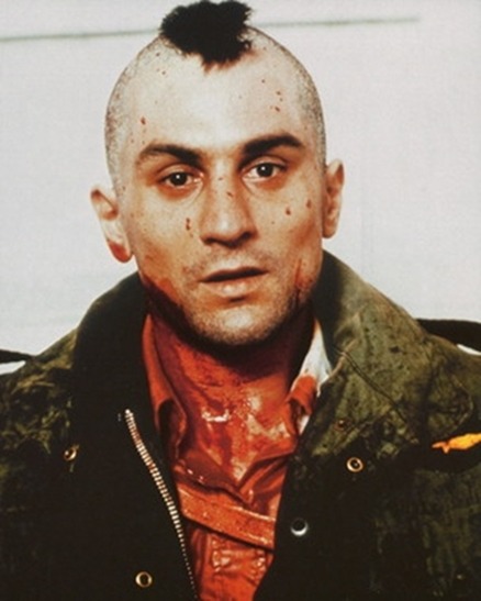
‘real’. Other thrillers in this style often have morally dubious, untrustworthy or unstable characters, for example the character of Travis Bickle in Taxi Driver – this character is an iconic example of an anti-hero in cinema. Zodiac, based on a true story, also introduces several different characters in the hunt to catch a killer though they are consumed by their obsessions and fail to catch the zodiac killer as a result.


Most psychological thrillers also have male protagonists and explore the minds of men, and in the vein of these films I would make my main character male. Drive, for example, is based around a fairly understated crime story though it can be said to have psychological aspects as the second half of the film begins to explore the psychotically violent nature of a seemingly mild-mannered protagonist. The trailer as a result accentuates the different and often dangerous aspects of the male protagonist’s mind: he is shown violently assaulting and beating a man in an elevator while the music that plays is calm and classical, which draws attention to the shocking violence portrayed. At the end of the trailer, he is shown in one shot walking a woman and child to their apartment out of compassion set to the same classical music, though in the next shot the music cuts out abruptly as the character suddenly shoots a man down. In this way, the trailer juxtaposes the different aspects of the main character that are introduced at different points in the film in no more than five seconds and I take the view that my trailer would benefit from this shock factor and the demonstration of the character’s psyche.


The style of many psychological thrillers is often understated – most of them do not have particularly dramatic music or visuals (though that is not to say that these two components of filmmaking are unimportant to thrillers of this style). In comparison to trailers for more action and horror based thrillers such as Prometheus, which has an intense combination of dramatic visuals and ominous music, psychological thriller trailers are fairly quiet – for example, the trailer for No Country For Old Men has little to no music and is mainly based around dialogue and presenting scenes of tension. The trailer for A History of Violence, another highly psychological thriller, uses sound effects to accentuate the tension and drama. Moon, meanwhile, uses calm piano music from the film’s score to present the daily life of the main character, while the most dramatic parts of the trailer are notable for an absence of music – at one point, when the main character comes across a clone of himself, the music abruptly and dramatically cuts out. Some psychological thrillers, and in particular the trailers for them, are highly stylized.  The trailer for The Master, for example, uses percussive and unconventional music, as well as having drawn out, slow paced camera shots such as one of Joaquin Phoenix following a car by a river and one of him walking across a street in a suit. This style creates tension simply because it is unexpected for a film trailer – most modern trailers are fast paced and build up to a finish by using increasingly dramatic music and visuals – this, however, layers lines of dialogue on top of one another which is a more unconventional way of adding drama to the story and is far more psychological, given that the dialogue itself relates to the psychological condition of the main character who is seen walking down the street while all of this is happening.


Most psychological thrillers I have seen often have complex and intricate plot lines – some feature plot twists (e.g. Fight Club) while others will have nonlinear plotlines: the main story of Memento, for example, is told in reverse chronology, while The Prestige unfolds in random order. As a result, trailers for psychological thrillers have quite a lot of storytelling to do in order to give the audience an idea of what the film will be like. Many trailers I have viewed can be split in to segments which are distinguished from one another by, for example, the use of music cues and fades to black. The trailer for Fight Club, for example, uses five or six different bits of music to describe the different plot ideas that come in to play. The voiceovers of Edward Norton’s character also mean exposition can be given to the story within the 2 minute trailer – he introduces different characters, often at the end and beginning of one of the ‘segments’ of the trailer – for example, the character of Tyler Durden is introduced when the narrator states ‘I longed for a different life… and this is how I met Tyler Durden’. This is when the music changes to become more dramatic. In this way, the film manages to emphasize certain plot points through stylistics rather than telling too much of the story, which is a highly effective method of putting together a trailer for a psychological thriller.


The structure of the trailer for Memento is also particularly clever, as it introduces the concept that the film is based on by using the different characters that the main character, Leonard Shelby, comes in to contact with throughout the course of the film. For example, he meets a character named Teddy who is first through a title card that states ‘friend’, though another appearance of him in a trailer is preceded by a title card stating ‘liar’, demonstrating the dubious nature of Leonard’s memories of the people he has met and the things he has done, a theme that is important later on in the film. Unlike the trailer for Fight Club, this trailer uses similar music cues and never modulates in tone: the distinction between these two trailers is, as a result, that Fight Club develops the themes and characters by suggesting different aspects of the story, while Memento does the same by introducing the basic plot concept. 

A graphic from the Memento trailer 

The psychological thriller genre is often based on complexity and intricate storylines – both the characters and plot present within them are often multi-layered and particularly dark. As a result, these types of films are often thought provoking and stylized in ways that make the audience ask questions as well as draw out both emotive responses from them.

Tuesday 21 August 2012

A2 Summer Trailer Research Work

1: The Master (2012)


This is not exactly a thriller or horror trailer, though it certainly has an aspect of mystery which is what I would like my trailer to rely heavily on - I particularly liked the classic style of it and the way it was edited, for example the fact that it is mainly comprised of long shots that have an ominous feel to them such as the one that zooms in on Joaquin Phoenix's face as he walks. I also liked the fact that it was edited to leave a lot of ambiguities and unanswered questions - for example, there is a brief shot of Philip Seymour Hoffman about to address the camera about something unclear to the viewer, and most of the dialogue is very ambiguous e.g. 'you've wandered from the true path' and 'you seem to inspire something in him'. I would certainly borrow from this trailer in this aspect, as mystery is which makes most trailers particularly thrilling. The look and feel of the trailer is something I particularly liked as well - having a similar look to this, as well as similar music, is something I may consider.

2: No Country For Old Men (2007)


In some ways this trailer is very similar to the trailer for The Master - it is never particularly scary or suspenseful, mainly mysterious - however, this is a style that, with the right footage, can be particularly gripping. This trailer, for example, builds up to the action but never actually shows it, leaving it to the imagination of the audience. Like many trailers, to do this it often cuts to black before showing something, which is a convention that I would likely follow in my own film trailer. Avoiding showing the actual action and instead implying it also gives the trailer as a whole a particularly suspenseful paces, as there is a sustained build up with no actual relief.

3: The Cabin in the Woods (2012)


This trailer feels more like a proper horror film than the trailers of the other two films, which are more mystery and suspense thrillers. The film itself is something of a pastiche of many other modern horror films so the trailer as well as the film itself includes many horror conventions - for example, at the beginning the music suddenly stops playing which immediately changes the atmosphere and increases the suspense.

4: Moon (2009)


This is a psychological thriller trailer that I liked because it introduces the more thought provoking ideas of the story without giving away too much. Like No Country For Old Men, it suggests certain ideas without actually showing them on screen, though while No Country For Old Men suggests conflict and violence, this manages to cleverly suggest the idea of cloning that is introduced to the film without properly showing it. I particularly liked the way the clone was first introduced, which is done in a style traditional with some trailers. The music fades out and there is a dramatic silence when the clone is shown, but it cuts away from any further plot details to instead show the critical reception. I particularly liked the fact that the situation in question was set up to be something mundane, which made the reveal all the more shocking.

5: Prometheus (2012)


This is a trailer for a sci-fi action/horror film and the trailer is suitably thrilling thanks to many different devices used within it. The music is iconic, unique and intense, and uses dramatic sound as well as music itself to create tension - something which has become particularly common in modern trailers (other trailers that have become popular due to their use of sound include Inception). In the second half of the trailer, flashes of different dramatic camera shots are shown which adds suspense and intensity to the trailer as well, a technique that can quite easily be replicated and is also used in many different trailers, particularly horror and action trailers.

6: Drive (2011)


Like many trailers for action films, Drive manages to blend telling some of the story with demonstrating the action - most of the dialogue is done in voiceover while the action is shown playing out, something which happens in most action trailers now. Different music is used throughout the trailer which splits it in to different parts, a trailer making device that can be used to, for example, demonstrate different characters in the film or different aspects of the story. I particularly liked the use of classical music at the end of the trailer, as it demonstrates the arthouse aspects of the film and gives the audience more of an insight into what the film will feel like, rather than tell the entire story.

7: A History of Violence (2007)


Like some of the other trailers I have used such as Moon and The Cabin in the Woods, this trailer starts off in a mundane way, using titles to describe the quietness of the town the main characters live in as well as focusing on the everyday lives of the characters (one character is shown playing baseball, for example, while the main character works at a cafe). Like the other trailers, the change in tone and danger is signified by the music cutting out abruptly. This particular trailer also features actor names, demonstrating the ensemble cast.

8: Memento (2000)


My favourite aspect of this trailer is the way in which it cleverly presents the concept of anterograde amnesia the film and what it leads to within the story. For example, the opening of the trailer sees the main character explaining his condition to another man, and at the end of the trailer he does the exact same thing, eventually saying 'I've told you this before, haven't I?' The trailer also introduces characters under title cards such as 'friend' and 'lover', though the idea that the protagonist of the film cannot fully know them is introduced when they are re-introduced in the trailer as, for example, 'liar'.