Wednesday 12 December 2012

Title Planning

For my title, I was influenced by mostly one word titles such as 'Memento', 'Shame' or 'Drive' - titles which have obvious and dramatic connotations. In fitting with the fact that the style of this film as a whole is generally different to the more urban, street-based stories of crime and gangs that British cinema is renowned for, I wanted my title to refer more to the ambiguities of the story and the development of the main character, in particular his questionable morality and the questionable amounts of danger that are placed upon him. Words that came to mind included:

  • Uncertainty
  • Doubt
  • Apparition
  • Illusion
However, I realised that as well as bringing to mind the ambiguities of my story, I also needed the title to have a strong and bold feel that has a more visceral tone. I came up with:
  • 'Disturbed'
a title which, in my opinion, denotes brutality and makes a bold statement about the film and the main character. As well as this, I feel that having a graphic announcing this as a title after the final shots of the film - the character of Frank looking out of his house window at something the audience never see - could also suggest the ambiguities of the film, but in a more tough and dark way. 

Sunday 9 December 2012

Graphics Plan


I produced this in order to test out certain templates on Final Cut Pro X and see whether they would work as titles for my final trailer. Overall, I feel that they work well for the atmosphere of my trailer and actually look quite professional. A few points of note, however:
  • As it stands, I am going to use the second film festival accolade template, with the cross dissolve between the graphic and the video footage, taken by me, that plays after it - I feel that it has an immersive quality. However, this is subject to change depending on whether the cross dissolve works with the actual camera shot which will follow on from the film festival graphic.
  • I am not sure about the graphics template which announces my name as a director - the way I have laid out my name, with the 'Helvetica Nue' font and the surname in bold is very professional looking in my opinion, though the way in which it fades between 'a film by' and 'Christoph Macdowall' could be too slow paced for my trailer.
  • The font I used for the final title template is called 'Hei', though it is not the same as the fonts I used for the actor and director names, as putting certain words in bold within the 'Hei' font did not seem to work. However, the two fonts do not feel mismatched so this is not a particularly pressing issue.
  • My idea was to, when announcing the name of the lead actor, have the surname in bold and the first name in regular typeface - what I actually did, however, was make his first name in a particularly light typeface and I feel that this is far more professional looking.

Studio and Distribution Research

The kind of film I plan to make is medium budget, sophisticated and not inherently British in the way that thrillers such as films such as 'Ill Manors', a film using the London riots as a setting, are. As a result, production companies such as BBC Films or FilmLondon are not the kinds of production companies that would produce and distribute my film - they tend to focus on more low-budget films that have a more realistic, gritty British edge. A production company that has produced some fairly prominent films that are not quite at the level of high budget blockbusters but are not totally independent and low budget is Endgame Entertainment: this year, they were attached to the successful sci-fi film 'Looper', which was made on a budget of $30 million - as it is a science fiction film with two major stars, it naturally has a higher budget than what mine would have though I still believe that ours are in a similar category of films. Endgame Entertainment also produced 'An Education' (2009), a British film, 'I'm Not There' (2007), a biography of Bob Dylan with an arthouse edge.


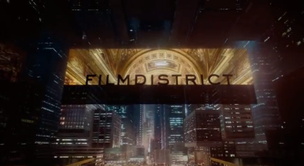
Another production company that I can picture being attached to my film is FilmDistrict, the ident of which is something that has also inspired me. FilmDistrict also distributed 'Looper' as well as the film 'Drive' which, of all the recent films, has been one of the most influential for me. FilmDistrict generally produces fairly commercial films, however, and is based in Los Angeles, and so it is unlikely that it would actually produce my film - only distribute it.


For the production end, I picture Focus Features as making my film. They are a division of NBCUniversal, though are responsible for making arthouse films. In the past, they have made 'Eastern Promises' (2007) and 'In Bruges' (2008), two British films that I think mine could be comparable to.


However, as my film will be reasonably low-budget and will be a British production, I feel it is necessary to address British production companies that specialise in smaller scale films. The main British production companies that produce low budget, London based films are: BBC Films, Film4 and FilmLondon.


Though my film is fairly ambitious and I can picture it having some international production and distribution behind it, I also think that with the actual production of the film - particularly with regard to acquiring locations and supporting actors - it would be necessary to work with a production company such as FilmLondon.

Ident Planning

For this trailer, I have decided to raise the bar with regard to how I produce my ident and intend to go beyond simply using a Final Cut Pro graphic template like I did last year. I have decided to play to my strengths and make an ident out of video footage and editing rather than using an advanced computer software, which I am less advanced with. 

Two idents in particular influence me for the kind of ident I want to make, Film District and Miramax:


The Miramax ident in particular is something I think I could replicate - London generally is not a high rise city, though I live fairly near the Canary Wharf district which is the main high rise centre within London, and it would be easy enough for me to get stylish and good quality video footage of the area. This is a still image from video footage I have taken of Canary Wharf in the past with my own camera, and I am hoping that with more time and a better quality camera I will produce an image suitable for my ident.


What I would like for the actual title is for them to fade in while the image itself fades to black - rather than have the title placed in the middle of the shot like Miramax, I am going to place them just above the skyline of the buildings of Canary Wharf.

Friday 7 December 2012

Sound Planning

Diegetic sound

Recently, I practiced using microphones to record dialogue - the difference between using a boom microphone and a camera microphone, or even a directional microphone when it comes to filming dialogue in a busy place became instantly noticeable. All of my key dialogue scenes occur in busy places, for example a bar and a city street, meaning I will definitely need to use the boom microphone to film. Obviously, it is more complicated and some dangers will arise, for example:

  • The boom microphone may show up in the frame when being held - this sometimes even happens in TV, and occasionally with films a boom microphone or operator is seen in the reflection of a window or mirror.
  • It will also mean that I will need a clapper board in order to sync the sound from the microphone track and the video recording from the camera.

Ambient sound

I also plan on using a separate microphone track from the camera, using a boom microphone, to record ambient sound. I will create separate ambient tracks to play during the bar scenes, outside the bar, the meeting on the bench, when Frank picks up the bag and when he is in the market. These will all be done on location, so I will be taking the microphone to the Zerodegrees bar, the road outside it and the Spitalfields area.


Tuesday 4 December 2012

Aesthetics and Visual Style - Planning

One of the directors who influences me the most with regard to visuals is Michael Mann. As a director, he is renowned for his visual style, particularly his use of cities and modern architecture. Often, in films such as 'Heat' or 'Collateral', the architecture and shape of the cities he uses - in the case of both these films, he uses Los Angeles - dominates the framing, or is at least prominent within it. This style of filming has influenced many other directors and films, most notably the recent film 'Drive'.


Even in indoor scenes such as the famous bank heist sequence from 'Heat', Mann chooses locations demonstrating stylish modern architecture.


As well as having a mise-en-scene demonstrating modern architecture and city lights, Mann also uses colour in an expressive way in his films, particularly the film 'Manhunter'. This has influenced me very much, and I have found ways of adding colour and style to certain locations in my film and will be utilising these.


Most low-budget British films adopt a very different visual approach to what I am influenced by and how I picture my trailer to end up looking - this comes down to the fact that mine has a different subject matter to theirs. Most British thrillers are often based around social realism and are designed to reflect the struggles of British youths in an honest way, and as a result they do not try and stylise their visual style and often set their films in the more gritty parts of London such as council estates. Though there is clearly commentary behind this, I think that the handheld camera style adopted by most British thriller filmmakers and the washed out colour palettes that are often seen in British films are overdone and are uninteresting from a filmmaking perspective - above everything else, my film is based around the middle classes and is more of a morality tale with psychological themes than a story about social struggles and youth crime culture.

The kind of visual style I want to avoid.

One of the locations I have chosen is the Spitalfields area. Though it is not too far off the settings of social realist thrillers, in terms of basic appearance, to me it has very different connotations. The architecture there is a mix of old and new, and has a pristine look to it - it is surprisingly close to the city, with some iconic modern highrise buildings being within sight when one is there.


These are images I acquired while reccying the location.

Directors such as Michael Mann also often use postmodern architecture in their films, with 'Manhunter' being the best example of how he uses this.


Influenced by the kind of postmodern and often metallic looking architecture seen in films by directors such as Michael Mann, I have chosen to set some of my trailer inside a bar which is also a microbrewery.