Sunday, 10 February 2013

Soundtrack/Score Development

When making the trailer, I had three pieces of pre-existing in mind, one for each act - the first was 'Hand Covers Bruise' from The Social Network, the second was 'On The Beach' from Drive and the third was the theme to the film 'Heat'.


The sound I imagined for the third act comes in at around the 3:30 mark.

I have had Joseph Ruddleston (who is the brother of my lead actor Callum) working on the soundtrack instead of trying to find copyright free music or, indeed, writing it myself - this is because I want my trailer to appear to have a unique sense of mood and style that could be a selling point of it, and in order to achieve this it is essential that I have a soundtrack that is as professionally done as possible which also feels iconic in its own right. 

Joseph has sent me some draft versions of his score and so far, many of the ways in which his work has differed from my expectations has been a positive thing for me. His piano piece was less minimalistic than I pictured but this makes the piece feel more authentic as a whole, while his track for the third act has more of a melodic theme to it before it becomes dissonant and intense, but I feel that this also gives the soundtrack a more listenable quality and fits perfectly with the film.

I feel that I am at an advantage with who I have chosen to write the score as he is highly skilled, meaning that he has been developing a refined version of his soundtrack based on feedback I have given him. The soundtrack of this trailer is highly important to me and I feel that as long as it is finished within the next few days, I will be able to upload my trailer before half term with a truly effective soundtrack. 

Friday, 8 February 2013

Magazine Research


Publishers

Bauer Media

Empire Magazine is published by Bauer Media Group, a company which owns over 100 different brands, in particular magazines which it sells over 38 million of a week. The company was founded in 1875 and has been privately owned by the Bauer family since then. Other than Empire Magazine, Bauer Media owns Q and Kerrang, two highly popular music magazines, Heat, the definitive celebrity magazine, and Magic 105.4, a top radio show. This demonstrates how Bauer Media is not solely focused on products relating to film.

On the Bauer Media web page, Empire Magazine is described as ‘the premier movie destination, providing indispensible insight into cinema, both blockbusting and classic. Online, in print and via app Empire’s unparalleled access has led to world-beating exclusives such as the first look at Heath Ledger’s Joker, to extraordinary access to Steven Spielberg who guest edited our 21st birthday issue, to George Lucas’s backyard in the run up to Indiana Jones and the Kingdom of the Crystal Skull’


British Film Institute

Sight and Sound Magazine is, unlike Empire, owned by a company exclusively based on film – the British Film Institute. The British Film Institute was formed in 1933 by the Royal Charter in order to ‘encourage the development of the arts of film’ and promote it – therefore, Sight and Sound is a slightly more cerebral magazine than Empire due to the publishing behind it. The British Film Institute has now also taken over the UK Film Council, meaning that most of the funding for British film comes from here. I think that a magazine which would have my film as the main feature would be more likely to be similar to Sight and Sound than Empire Magazine – therefore, the British Film Institute is a relevant institution to me.

Wednesday, 6 February 2013

Shooting Schedule - Poster and Magazine

Taking images for poster and magazine

 - General location required for main poster and magazine images is near North Greenwich tube station - an industrial area that is not far from the O2 entertainment centre and the river. This is not far from my house and takes around 15 minutes on a bus (it is also the area where I filmed the picking up the bag scene for the film).
 - I will need to take:

  • Digital camera 
  • 1 light
  • Reflector
  • The bag as a prop for the main magazine image 

 - I will need to meet my actor at this location at around 3:45 to take the magazine image, which is going to be a daylight one. However, as I need to also take a night time shot I do not want to take this too early as it will create unnecessary waiting time before taking my main poster shot. For both the magazine and the poster shot, the character will wear the same outfit, which is the one he wore during the scene where he picks up the bag.
 - I aim to take my night time shots at around 5 o'clock to 5:30. This will give the shot a night time look, but also have some light which will guarantee that the shot is clear.
 - Over the half term period I will also aim to take 4 other shots for invented films to go on my magazine cover. I am going to create a variety of images - one with hints of science fiction, one arthouse, one a mainstream blockbuster and one a period piece. I will be taking at least one of these during the second week of half term as that is the best period of availability for any actors that I may use.

Friday, 25 January 2013

Filming Evaluation - 25/01/13

At this stage, I have filmed most of my trailer and all of the most complicated location scenes such as the bar and the meeting with the lawyer in the city. What remains to be filmed is Callum's character picking up the bag, him talking to a friend outside the bar (in which they discuss how much money Callum's character was paid for his job) and another dialogue scene in which he is told that there was no evidence of a break-in at his apartment.

Filming evaluation

Given the nature of some of my locations, I ran into some problems with shooting which I needed to overcome, in particular:

 - Location continuity. Callum's character is supposed to have an apartment, though the interior scenes of this were filmed inside my house, which has plenty of windows. As a result, I had to take extra care in ensuring that the house did not look too expansive and no windows revealing the exterior were seen. In one shot, I have cropped out some of the edge as an open window was in shot.
 - Difficulty of shooting in certain locations. Thankfully, the manager of the Zerodegrees bar which I filmed in allowed us to film there, though as they were not allowed to close the bar down for us or give us a certain isolated area to film in, we were unable to use lights as they would have too strong an effect on the surrounding areas of the bar and the people within it. This problem was not so drastic that it meant that I have had to omit or re-film the scene, though I have been doing plenty of colour and exposure editing in order to ensure that the shots are clean and bright enough to see. Furthermore, while filming the scene where Callum's character meets the lawyer we were actually filming in a location which we were not permitted to film in - this meant that we were rushed for time, leading to some problems with sound, and were not able to take as many shots as I would have liked. However, with regard to the latter, I was satisfied with the shots that we took while there.
 - Sound issues. At certain moments, particularly during the conversation between Callum's character and the lawyer, the sound did not come out particularly clearly. This is in part due to the fact that in some locations, we were rushed for time and did not check the levels, which has meant that I have had to re-film some dialogue scenes in certain locations or, during scenes where it is not noticeable such as moments when the characters are facing away from the camera, re-record the dialogue altogether.

Changes from the storyboard

I was surprised at the fact that so far, I have made very few changes to the storyboard, as last year there was a complete change of location, which to an extent meant that we had to change the narrative. Changes which I feel have been significant to my trailer include:


  • The location of Callum's character has now changed from a house to an apartment in a large apartment block. This change seemed natural, partly because my house was not convenient to film from the exterior, and partly because it seemed more likely that a very young commuter type would live in a suburban house.
  • I have added moments to the montage, as a) it felt too short to be an entire third act for the film based on what I had planned in the storyboard alone and b) it did not seem to suggest a change in gear for the film, but rather that the same atmosphere and plot points would be sustained throughout. This in particular would make the trailer look like it is advertising something which is not a full length film. The shots I have added have been more dramatic, in order to suggest that Callum's character begins to go on the offensive against the character (or characters) who may have set him up, suggested by a scene where he confronts the lawyer which turns violent and a shot of him brandishing a knife in another house, suggesting he is initiating an attack against a suspected enemy. 

Wednesday, 23 January 2013

Poster Production Update 23/01/13

Today's work included:


  • Finishing off analysis on similar posters
  • Finding potential fonts for the film poster
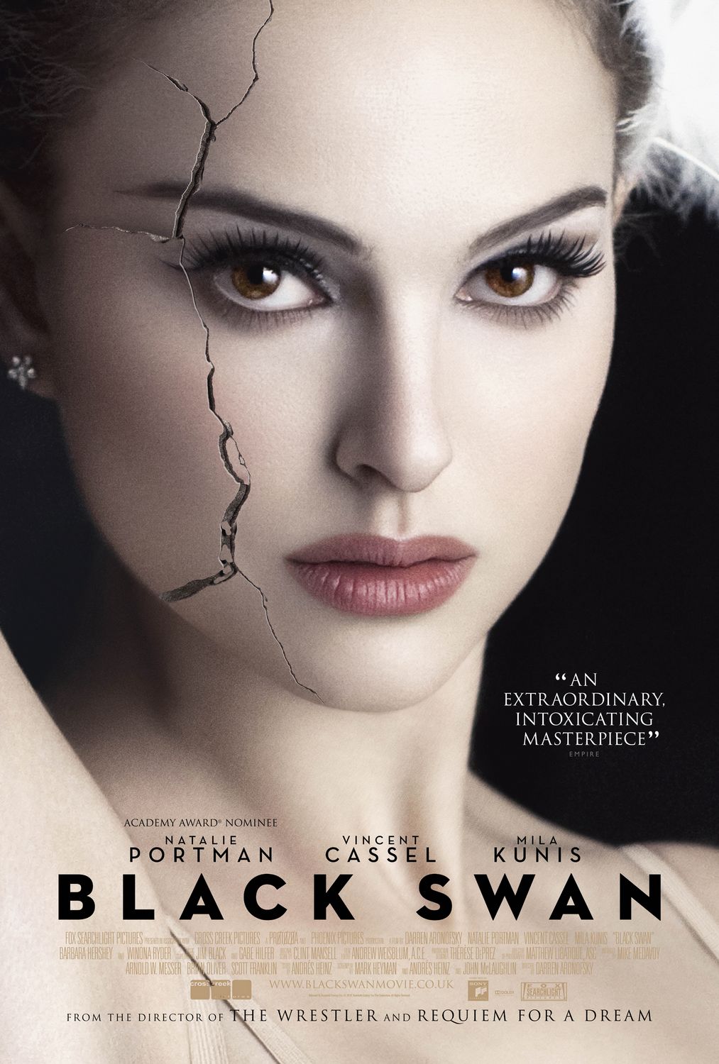
I have found quite a substantial amount of posters that I feel are effective and would like to model my poster on - however, most of these are quite different with regard to colour scheme, photographic content and fonts. As a result of this, the fonts that I have been looking for - on dafont.com - have all been varied so as to keep my options open, as I am still not sure what kind of underlying atmosphere my poster will have. The types of font I have collected so far have ranged from understated with an art deco edge to bold and with a grainy, blood splattered texture: which one I choose will depend on whether or not I decide to make my poster understated like the 'Black Swan' poster I have looked at, or more of a dramatic horror poster such as the poster for 'Shutter Island'.

Tuesday, 22 January 2013

Research into Poster of Similar Films


What makes this poster particularly effective to me is the way in which the image of the island has been edited to take the appearance of several different snippets of a picture put together hastily. This has a jarring and eerie effect and is in itself a memorable image, and it also establishes the detective concept within the story and connotes the idea of the film being a puzzle. The use of a match by Leonardo DiCaprio's face - an image which establishes intimacy - contrasts with the wide shot of the island and water surrounding it, giving him a vulnerable quality.


This poster generally has a feel of being clean and controlled - however, the cracks in the face of Natalie Portman's character are a nice touch as to me as they are not overdone, but are noticable and prominent in contrast to the clean look of the rest of the poster. They are highly suggestive of the cracking of her psyche, which is a major theme in the film, and are something which not many posters posess. The font also appeals to me strongly - it is neat and modern, but the wide lettering gives it a subtly baroque and dramatic feeling.


The reflection of the character of Patrick Bateman in his knife is highly suggestive of his psychopathically violent alternate persona - the poster as a whole has a clean, elegant look due to the way in which Bateman is dressed and the lighting of the picture - however, the tagline, referring to 'monsters' and the typeface on 'Psycho' feel like they belong in a different poster to the picture of Bateman within it, which reflects how shocking the film is when Bateman goes from being a Wall Street Yuppie type to a sadistically violent killer.


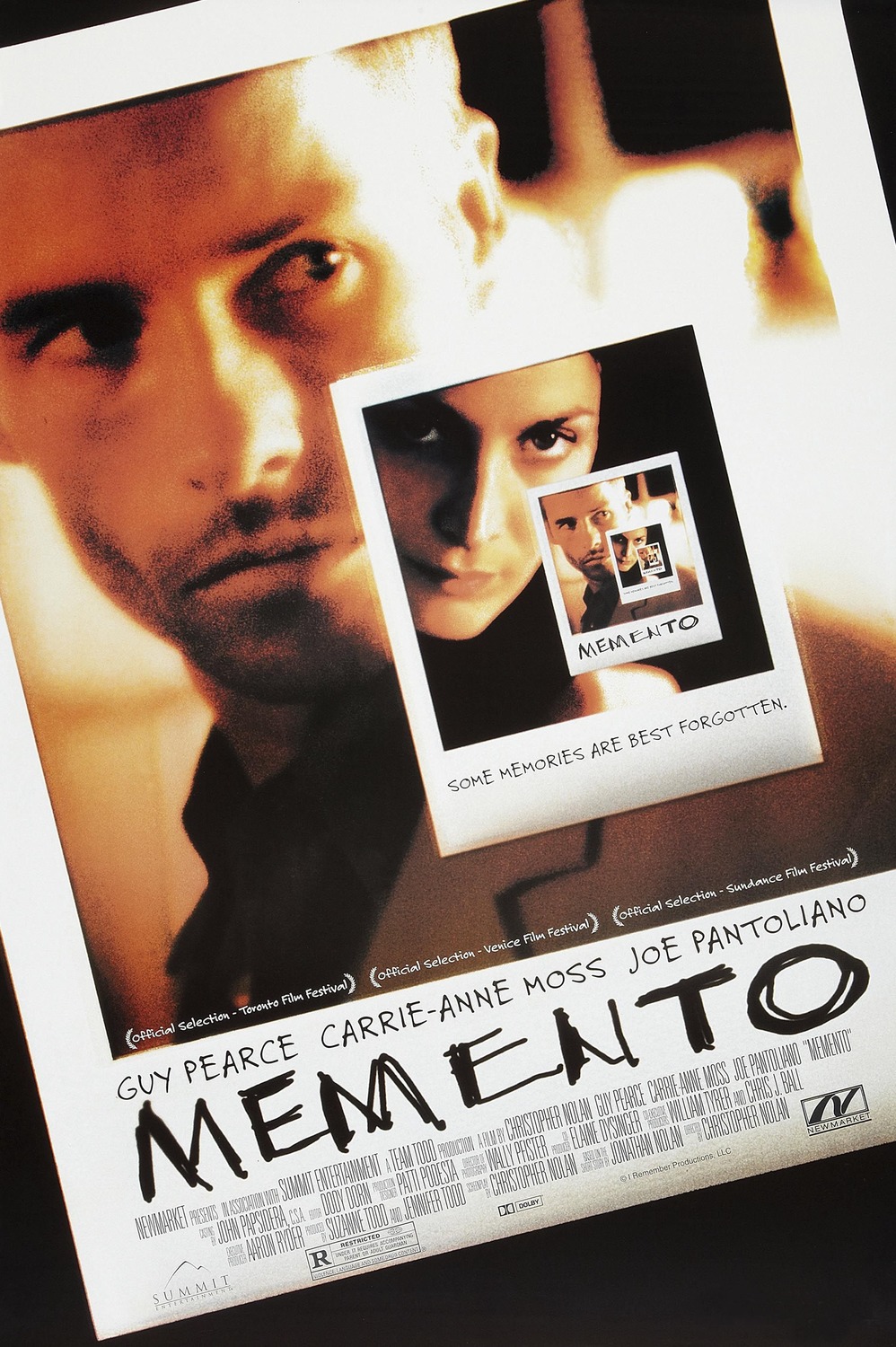
This poster appeals to me as every aspect of it, including the title and even the film festival accolades, tie in to the film itself, as they are written in the character of Leonard's scrawling handwriting. The infinite images are a particularly nice touch as they are very commanding and make you want to look at the poster for ages to take it in, and the way in which both pictures are slanted, giving the poster an even more twisted and rough look, is the finishing touch for me.


There are many aspects to this poster which give it an unconventional, 'cult' quality. Firstly, the pictures of the two main characters are rather goofy despite being composed and high-quality - Brad Pitt has a wide grin with a rough and beaten face, whilst Edward Norton's more somber and controlled face almost feels deliberate and over the top in comparison. Furthermore, the title itself is a striking and individual image, which means that it feels as evocative of the actual film as possible.


The fact that the face is shown very close up for a poster has a haunting effect - very little is established aside from this eerie image which makes the audience ask questions about the nature of the film. The moth with death's head on it, and in particular the way it covers the person's mouth, gives the poster a highly evil and twisted quality - if one looks closely, they can also notice that death's head is in fact built up of naked human figures and based on a portrait by Salvador Dali. This is another poster to use optical illusions, and like the one for Memento it causes the audience to unflinchingly stare at the poster.


The use of lighting in this poster is particularly important - the lights on the two sides of his face have a mysterious, ghostly glow which is fitting for the theme of the story. The way in which the number '6' is formed of the same light that shines on Bruce Willis gives the same haunting effect of something spectral being present within the story, as does the large amount of black within the poster: it denotes vulnerability and lack of security within the story, as there is no sense of location within the poster.


The way in which the characters are presented sideways has a jarring effect on the audience and gives the poster as a whole a feeling of being off-center and imbalanced. This reflects the twisted development of the character of Kevin, and almost asks the audience to look at the poster from a different angle - something which could be symbolic of the different angles there are to the main ambiguity of the story, which is whether Kevin's own psyche or the way in which he was raised caused him to commit murders.

Friday, 18 January 2013

Poster Research and Analysis

1. Following (1998)
 2. Only God Forgives (2013)
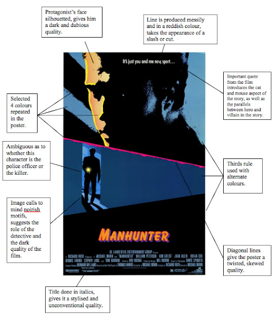
 3. Manhunter (1986)